Exhibit 6- Personal Business Card
Design Thoughts:
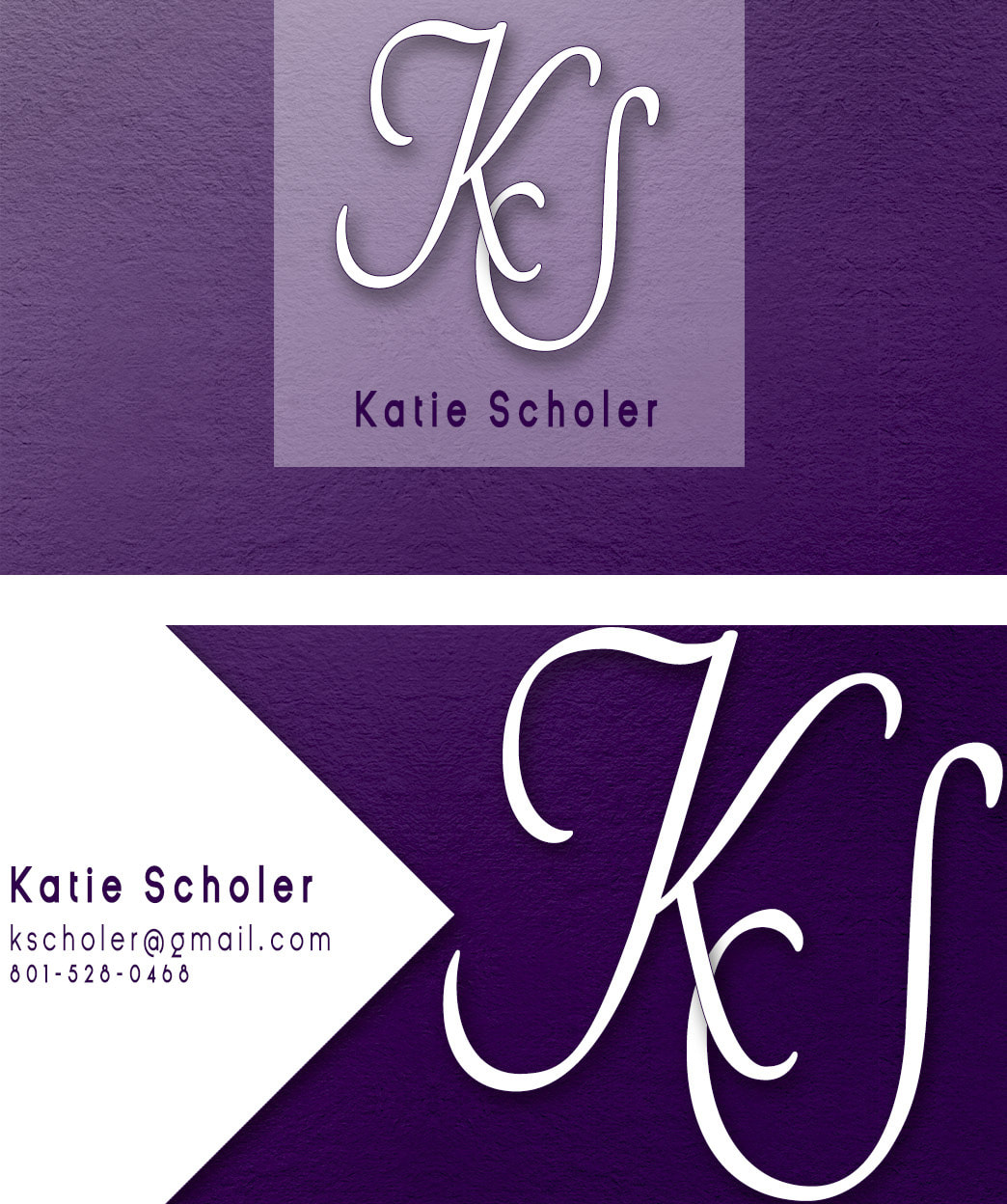
I wanted to design a business card that represented me. I love the color purple, so I decided to incorporate that color into my design. I like the clean feel of san serif font, but I also like script font as well, so I combined the two to come up with this image. I divided the card using the individual square that John McWade teaches in the video "How to design a business card fast." I like the contrast of the white and the purple to really make them stand out. The text on the name and contact is in close proximity so that the reader isn't divided on what is most important. I did bold my name so that it stands out the most, That is what I feel is most important. Also, the K and the S are close together so they are connected to one another. I used the same K and S on both sides of the card to add repetition. I like the clean squares, the white on one side turned, and the lighter opacity on the other side. I also added texture so that it wasn't so flat.
How I created this in Photoshop:
I created it in Photoshop by creating a couple of adjustment layers. First, I added one with a pattern, and then I added one with a gradient fill. Next I created some guides on how I wanted to divide up my card. I added the contact info, and then created the logo. I decided I wanted to mix things up a bit so I added the white triangle to give it more contrast.
