Exhibit 20 - Content Aware, Text, Face Swap
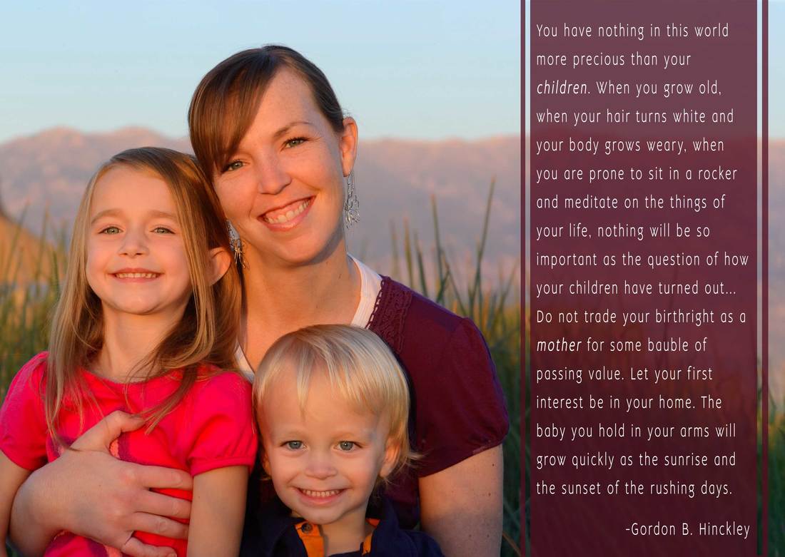
At this point in the course we were encouraged to to focus on things that we want to focus on for our portfolio. I don't have just one focus. I love creating invitations, info graphic, and fliers, but another thing that I love are quotes. I love quotes that circulate the internet that have a beautiful layout and create emotion. For this exhibit, that is what I wanted to focus on. I don't think anything stirs more emotion in me than my children. I feel like the years are quickly passing by. With me almost being done with school I am thinking about the future and what I want it to hold for me. I love this quote! It helps to guide me and remind me on what really matters most.
Design Thought:
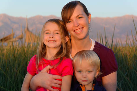
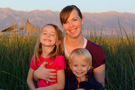
I wanted to find a quote that stirred emotion and was something that was important to me. As I circulated through my photos it because apparent to me at how quickly time is pass by and I wanted something that captured my feelings. I love this picture. It was taken several years ago and reminds me of how little they once were.
Photoshop skills/tools used:
Design Thought:
I wanted to find a quote that stirred emotion and was something that was important to me. As I circulated through my photos it because apparent to me at how quickly time is pass by and I wanted something that captured my feelings. I love this picture. It was taken several years ago and reminds me of how little they once were.
Photoshop skills/tools used:
- I used a photo I loved and used the crop tool to extend the canvas on the top and on the right, and to cut some off of the left side.
- I used content aware to fill in the extension of the canvas.
- I used the spot healing brush to fix spots where content aware didn't fill in very well.
- I copied a spot in the sky and copied it onto a spot where content aware wasn't working as well.
- I replaced my son's face with one where he was smiling.
- I used a clipping mask to adjust the brightness and curves on just his face so it would match the rest of the photo.
- I I place the text on one third of the photo, so that we filled in two thirds of the canvas.
- I used the character tools to fix the line spacing, the thickness, and other formatting of the text.
- I used the gradient tool over the entire canvas and changed the opacity of the layer so that the picture would show through, but not be as bright, and so the text would have more of a contrast behind.
|
|
